For the most part when we think of ‘neutrals’, we think of the obvious grey, black, beige etc; but there is a trick to incorporating colour in a subtle way!
Read More
For the most part when we think of ‘neutrals’, we think of the obvious grey, black, beige etc; but there is a trick to incorporating colour in a subtle way!
Read MoreWe hear the term ‘pop of color’ all the time, but how about a pop of black? A pop of color is used to add a wow element to a design; it adds interest and personality. It is often the final detail, but the first thing noticed.
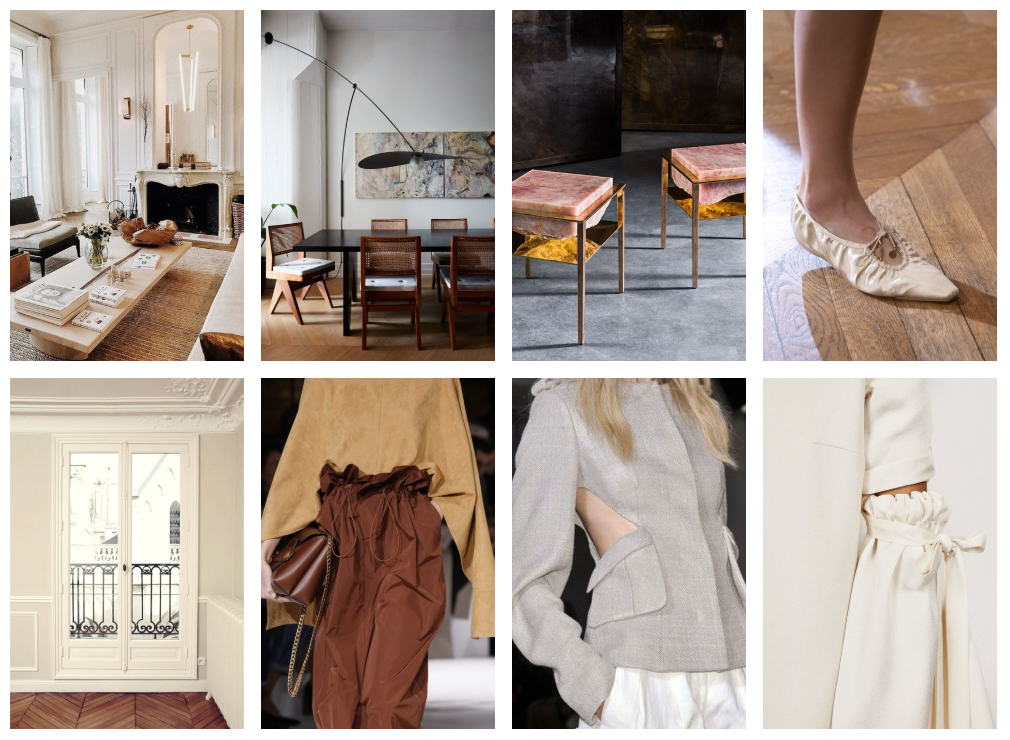
Read MoreOne thing that I have noticed is that any of my favourite looks, whether it be in fashion or interiors, often have little details that seem to make all the difference. Just take a look at the images I have added to this journal - nothing looks over the top or too contrived, yet there is something special in each design.
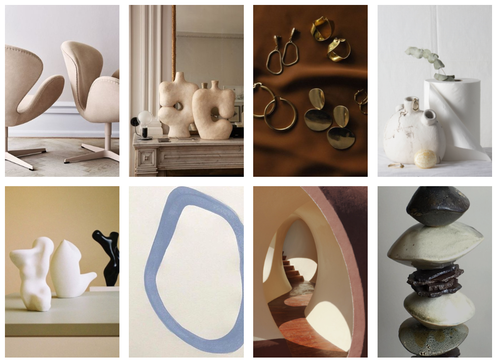
Read MoreI am totally loving organic shapes...and I’m thinking (and hoping) that they’re here to stay for a while. By no means is this a new concept. We can look to history to see many times that design was very nature-inspired and organic, however I think there is a real need for natural and softer shapes in a very tech-centred and busy world.
Read More