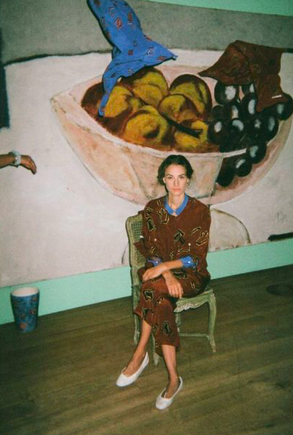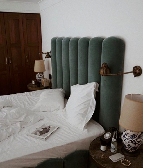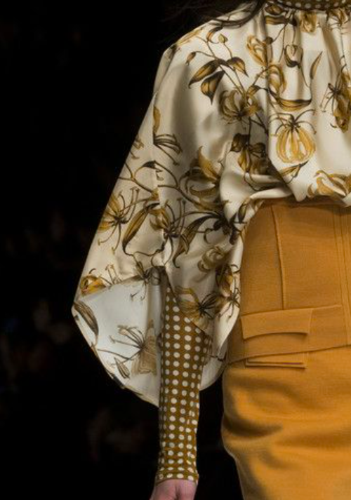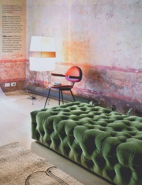
When Colour Feels Like a Neutral
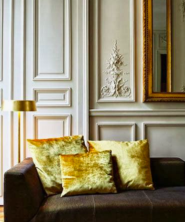
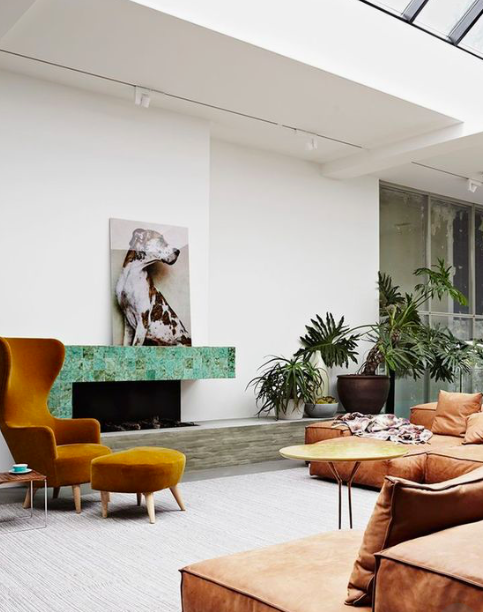
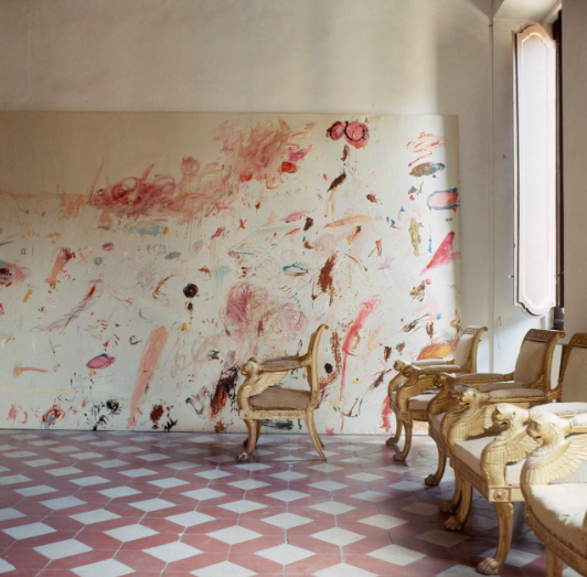
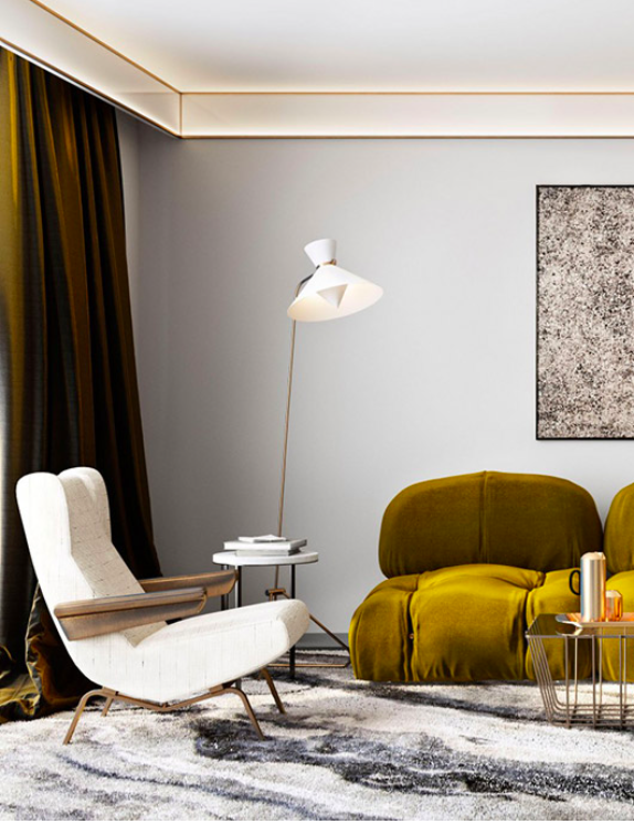
For the most part when we think of ‘neutrals’, we think of the obvious grey, black, beige etc; but there is a trick to incorporating colour in a subtle way! We collected some images where use of colour felt somehow neutral, and realized that all of the photos had a commonality. The tones of every colour used were those that could be found in nature...burnt oranges, earthy greens and the blues of skies and water. Bright colours can always look cool in an otherwise colourless interior, however if you don’t want that crazy contrast, then the key to bringing some colour into your neutral interior is to use colours of the earth.
Adding colour in this way is not only interesting but also feels super current as we are living in an age of elevated awareness of our impact on the Earth. There has been a huge shift toward more sustainable and humane practices in all industries. All this has brought about a draw toward more artisanal and natural decor which is a beautiful way to showcase some Earthy colours in your home.